My Role: UX Researcher, UX Designer
Responsibilities: User Research, Wireframing, Mockups, Prototyping
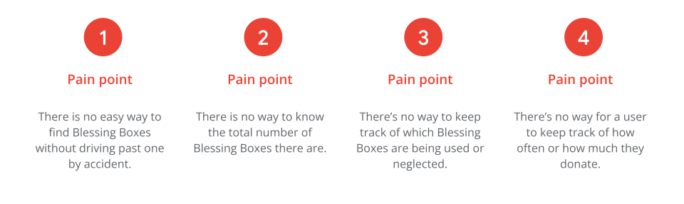
The Problem: Residents want to donate to the blessing boxes but do not know where they are located.
The Goal: To create an option that lets users easily locate blessing boxes in order to donate or use them.
Project Duration: March 2022 - April 2022
Additional Note: This was a project that I did for Google's UX Designer certification program. While I am not new to creating websites or designing a UI, the UX process was still new to me; but it is slowly becoming easier. This has been a great learning experience.
I understand that the UX Design process can vary depending on who the company is and/or the size of the company. As this was a personal project, I wore all of the hats for this project, from UX Research to final UI design.
The Design Process: Empathize, Define, Ideate, Prototype, Test
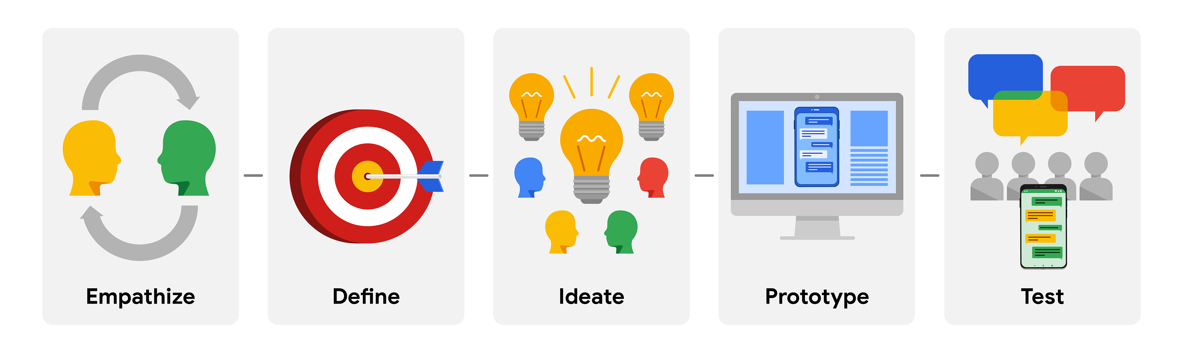
Understanding the problem
I was given the task to create a UX solution for social good. This was pretty exciting to me because I love doing what I can to help where I can. I knew almost instantly what I wanted to work on too.
There are a number of donation boxes around the area called "Blessing Boxes" that are used for storing non-perishable foods and items from the community. I love the idea; if someone wants to donate goods or if someone needs food - these blessing boxes can be used at any time of day or night and anonymously. (Some people don't care, but some people do.)
The biggest problems with this idea: As far as I could find out, no one knew how many boxes there were, nor where they were.
Researching the solution
Surveys | Competitive Audit Report | User Personas | User Stories | Problem Statement | Goal Statement
I started off by talking to various people in the area to find out how many knew about the blessing boxes and if they knew where they were. We talked about if they wanted to be able to use or donate to the boxes if they actually knew where to find them, and I'm happy to report that nearly everyone seemed very positive about wanting to use them.
I performed a survey and online poll of more potential users, performed a competitive audit report, created user personas, problem statements, and user journey maps to better understand the future users and "competition" (I don't think competition is truly the right word in this instance, but you know what I mean).
Competitive Audit Report
I did some searching on the Internet and sadly, there doesn't seem to be very many options - at least options that are easy to find. I did find a few that were quite similar in many ways as well as options that weren't. All of them seemed to be lacking in some ways, as if the designs were created as an afterthought just to say that they had at least created an information website about the donation boxes.
Key competitors:
“Goodwill” is not direct competitor in the sense that you can donate food, but they do offer a way to search for stores and donation locations in order to donate to them.
“Nourish Together” seemed like it was almost the same concept as what I was working on. The website is static and purely informational however. I felt I could improve upon this.
“ACC Blessing Boxes” was quite similar to Nourish Together, although it is only located on campus at Alvin Community College.
Competitors’ Strengths:
All of the above did offer ways to locate donation boxes/locations in order to donate or use. Goodwill's website did offer some interactivity, which was nice.Competitors’ Weaknesses:
Nearly every website I looked at seemed a bit dated. Most of them were static and informational. The mobile apps that I looked at looked quite dated as well and didn't seem to work very well. I had a lot of trouble actually using the apps to find something.That is fine and all, but I wanted to bring this idea into 2022. We're all on the go, and we're super mobile. I didn't want to just slap an informational page together and call it a day. I wanted this to be useful and interactive for anyone - whether they wanted to donate to the boxes or use the boxes in times of need.
Being able to really look into these other websites and apps helped me to shape an even better idea of what was needed.
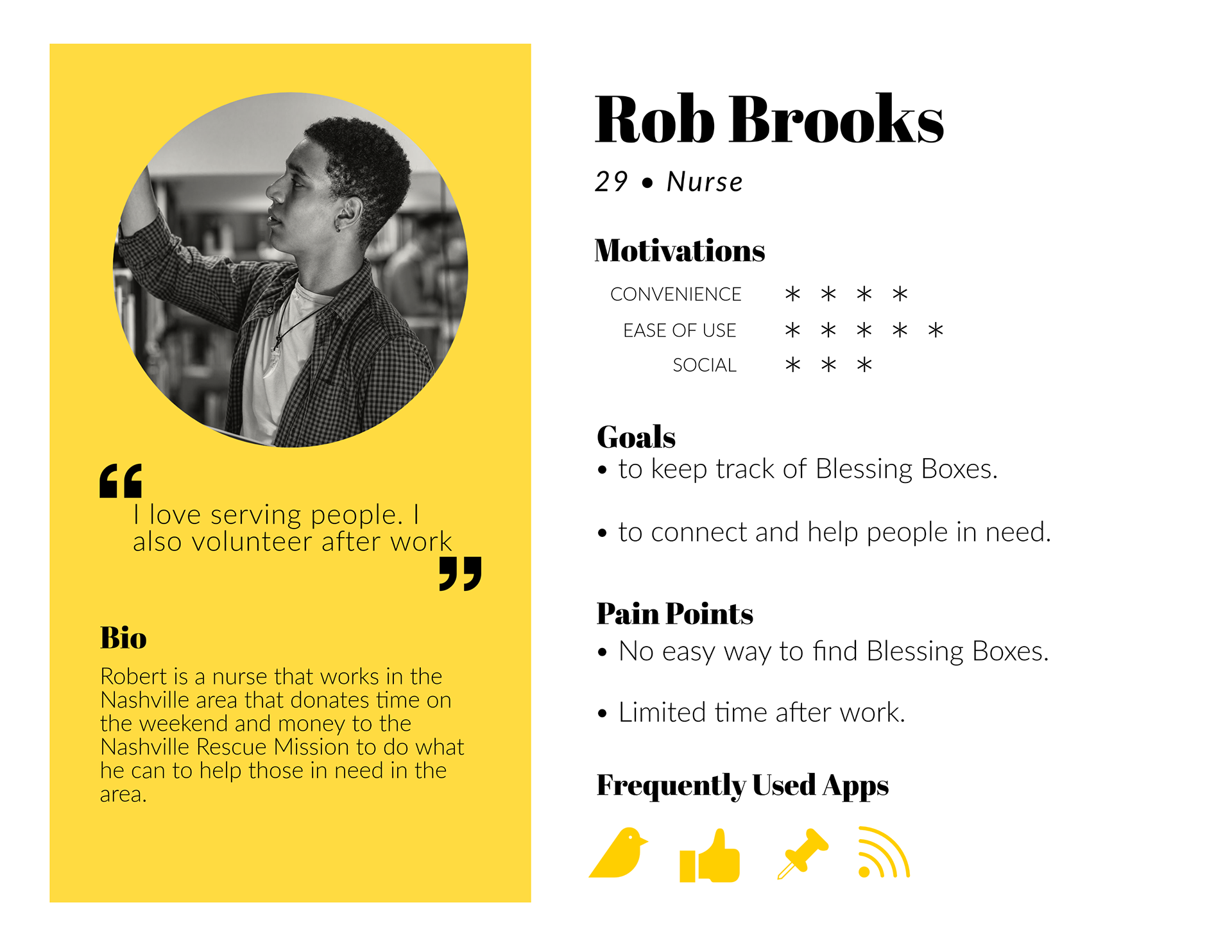
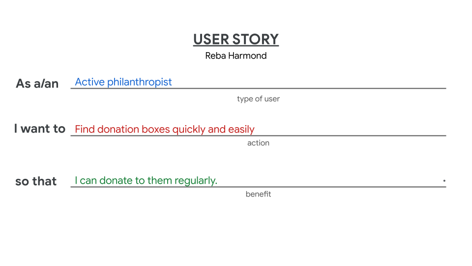
User Personas
I spoke with quite a number of people, and while most of them seemed optimistic about using a product such as what I was working on, I did notice a pattern with whom seemed the most "Gung-ho" about what I was doing. I did my best to boil them down into personas.
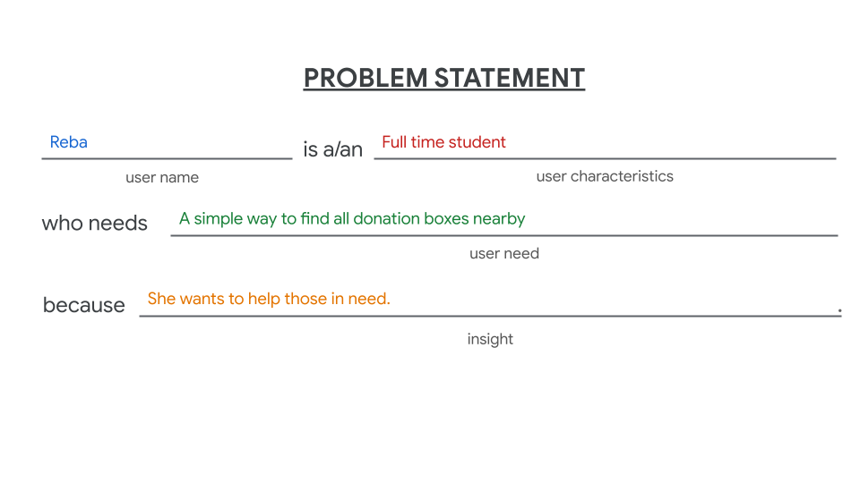
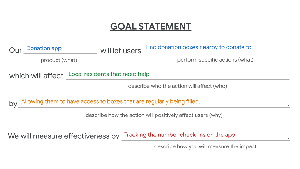
Defining Even Further
I further niched down with my research by defining a problem statement and goal statement based off of my User Personas to help me solidify the whole thing into something 'tangible'.
Starting the Design Process
Paper Wireframes | Digital Wireframes | Low Fidelity Prototypes | Usability Studies
After making my rounds around town to chat about this project, I felt like I had a decent idea of what people were looking for and what I could offer.
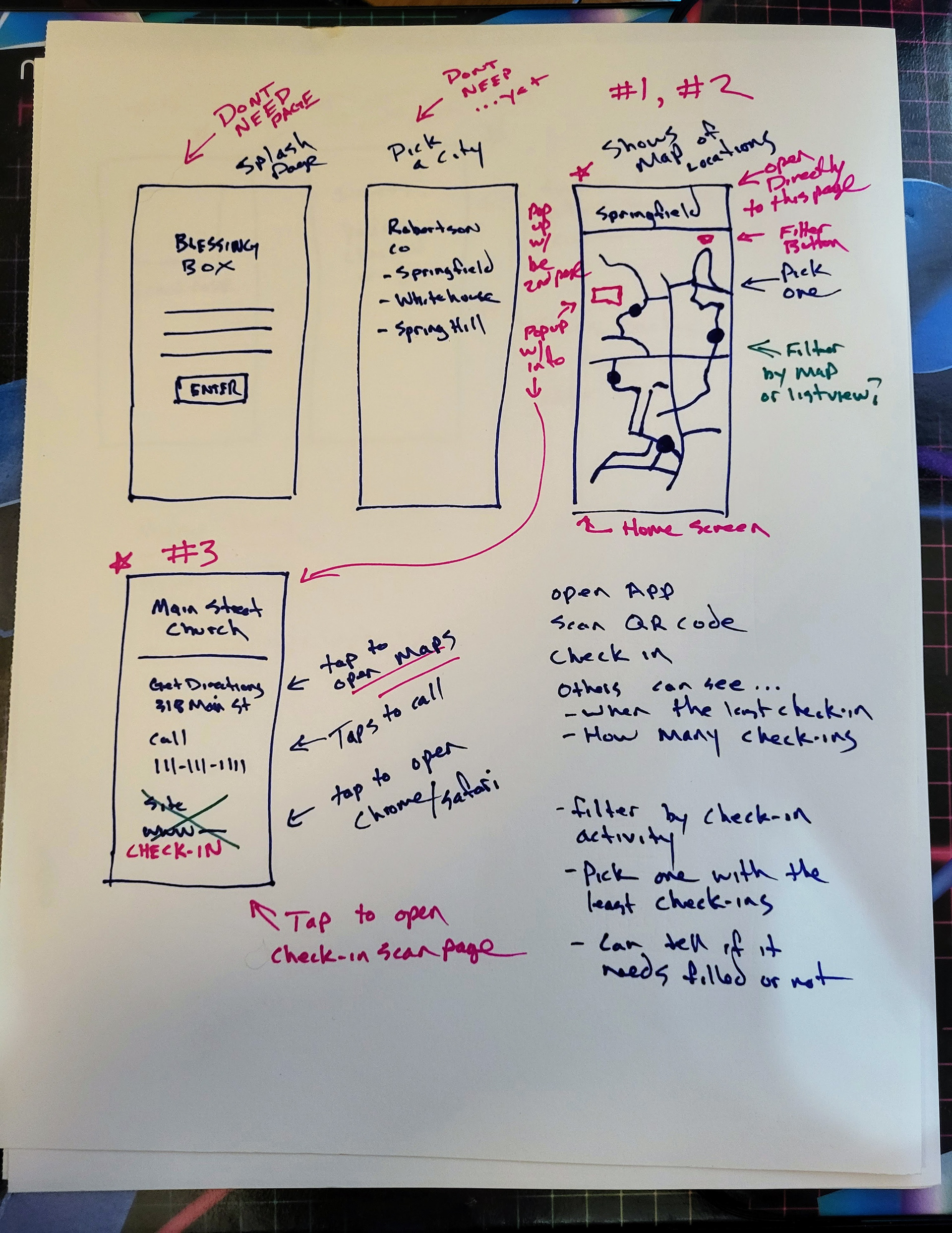
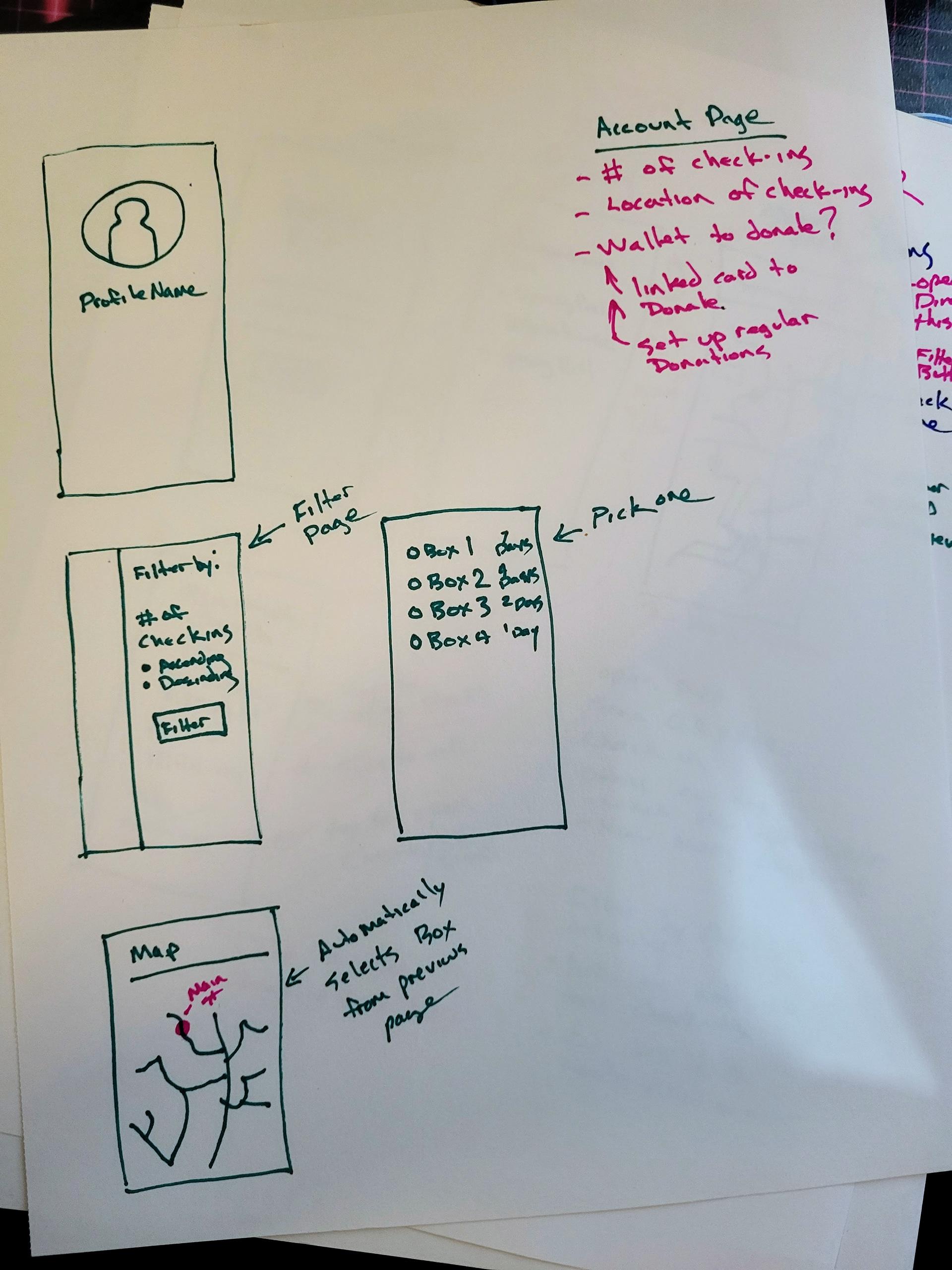
I started off by brainstorming quite a bit on paper, writing out thoughts and doodling wireframe ideas with pen and paper.
Once I had done that, ideas were starting to finally solidify themselves into my brain and I began designing Lo-Fi digital wireframes and prototypes. After that was done, I performed usability studies and let people use my prototypes to find out if they actually worked or not.
I was able to hammer out some rough edges by putting "fresh eyes" on them.
Paper Wireframes
These paper wireframes were very early in the process, and as I admitted earlier - I didn't have much of an idea of where to start at first. But after talking with others and looking at competitors, ideas began to take shape.
Once I started drawing ideas out, it started to snowball in a positive way.
Some of the ideas made it to the final design, but still this was very high level at this point.
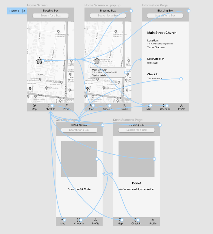
Digital Wireframes
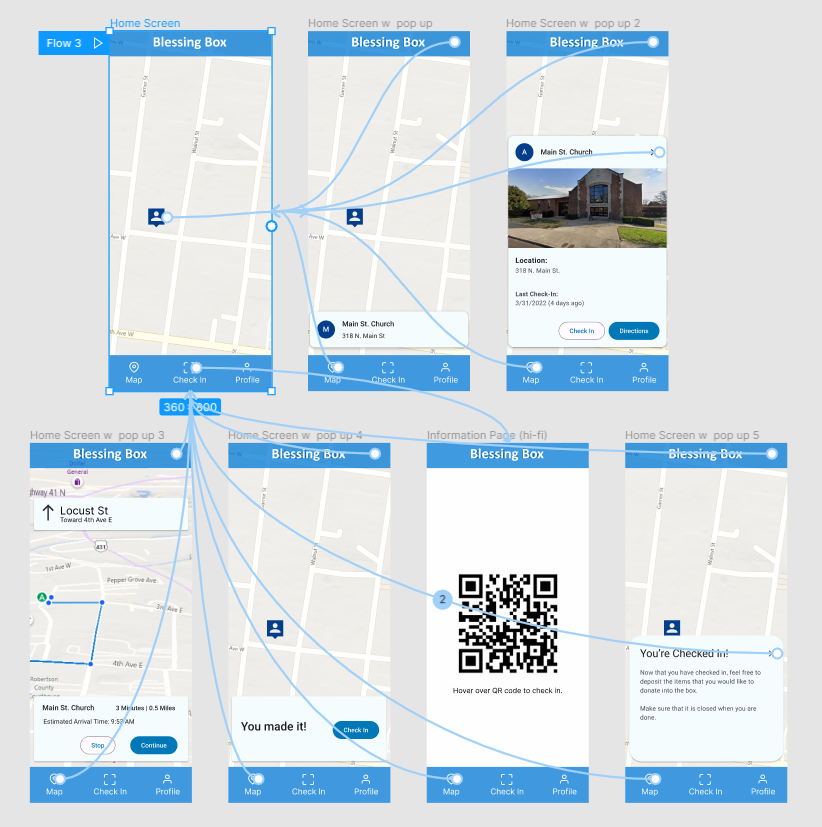
I was pretty happy with the way some of my ideas came out on paper, so I began to craft them digitally to see where things would go. I still wasn't quite sure, but I knew once I let others use the prototypes, I would find out quickly if I knew what I was doing.
I would like to note that I will be updating this case study over time as I update the app with many more screens.
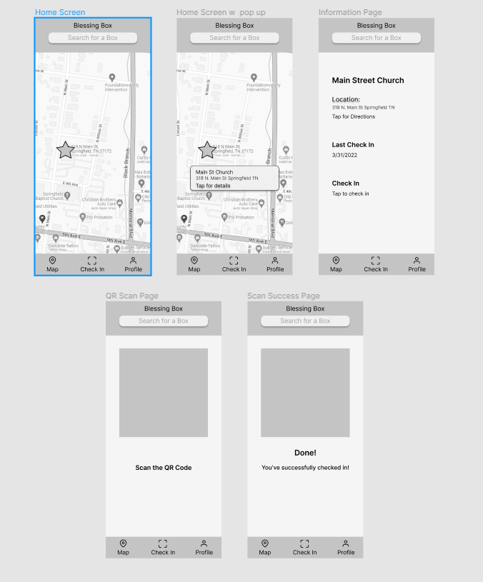
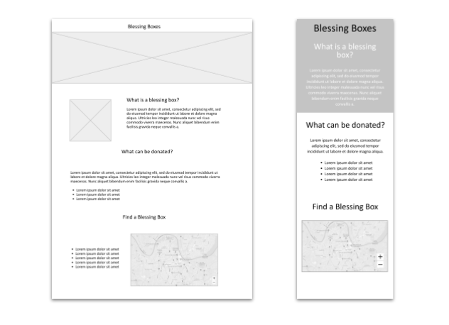
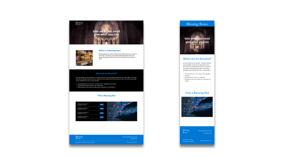
I didn't think about it until I started designing an accompanying website - but I realized that the features needed would be different here since users may not be mobile, but the main functions still needed to be there, but in a different way.
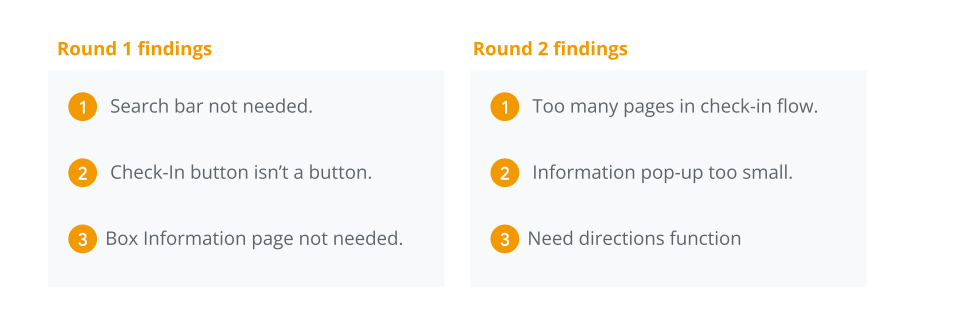
Usability Studies
I'm still pretty new at doing usability studies, so while I felt like I stumbled a bit - I do think I got through them together with my hapless victims, er I mean users - pretty smoothly.
Refining The Design
Mockups | Hi Fidelity Prototype | Accessibility
Mockups
Now that I had doodled on paper, created low-fi digital wireframes, and tested them out on users - I finally had a pretty good idea of what needed to happen. I did my best to implement the changes that were recommended to improve the experience. I felt like I did pretty well at bringing the results to life.
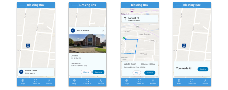
High Fidelity Prototype
Here's a nice high-fidelity version of the app prototype.
Accessibility Considerations
There were some concerns about the donation boxes not being noticeable enough on the home screen. The text may be too small for some users and there are no audio options for reading the directions out loud.
These were things that were mentioned by users, and I will be iterating these changes in the future to make the app more accessible for more users.
Going Forward
Takeaways | Next Steps
Takeaways
Impact:
The impact of this design will positively affect the community by allowing philanthropists to donate much more easily and frequently to the local blessing boxes. This will help out local citizens in need in a priceless way.
What I learned:
I am now more aware of the different use cases for a product depending on what platform it is being used on. Not all websites and apps work in the same ways because they will be used in different scenarios.
Next Steps
While I designed the website to simply be one page, I do need to design other pages such as a contact page and terms and conditions pages.
While I don't think it's greatly needed, an account section would be a "nice to have" for some users that want to track the times they have donated for tax purposes.
I am really interested (as well as users around town) in an option to donate money as well - which would have to be done digitally to the city. I know this is a hefty "ask", but I would still like to design a monetary donation flow into the app anyway.
I plan to update this case study as time goes on, as I work on these options.