My Role: UX Researcher, UX Designer
Responsibilities: User Research, Wireframing, Prototyping
The Problem: A local theater does not have an app.
The Goal: Design an app to help users find new movies, watch movie trailers, read reviews, and purchase tickets.
Project Duration: November 2021 - February 2022
Additional Note: This was a project that I did for Google's UX Designer certification program. While I am not new to creating websites or designing a UI, the UX process was quite new to me - so this has been a great learning experience.
I understand that the UX Design process can vary depending on who the company is and/or the size of the company. As this was a personal project, I wore all of the hats for this project, from UX Research to final UI design.
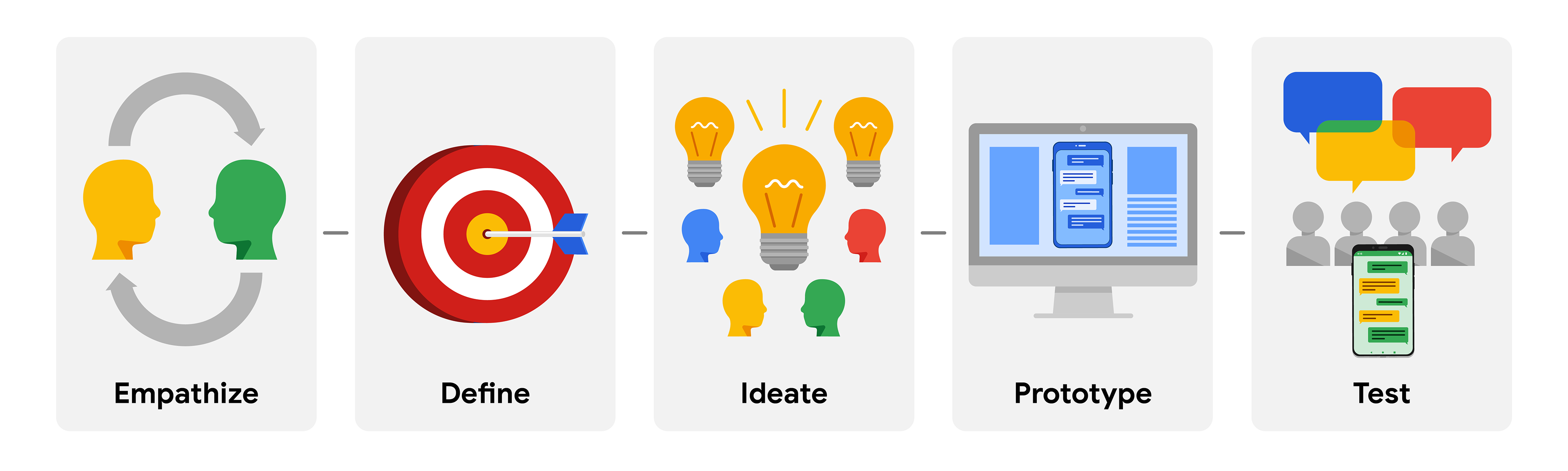
The Design Process: Empathize, Define, Ideate, Prototype, Test
Understanding the problem
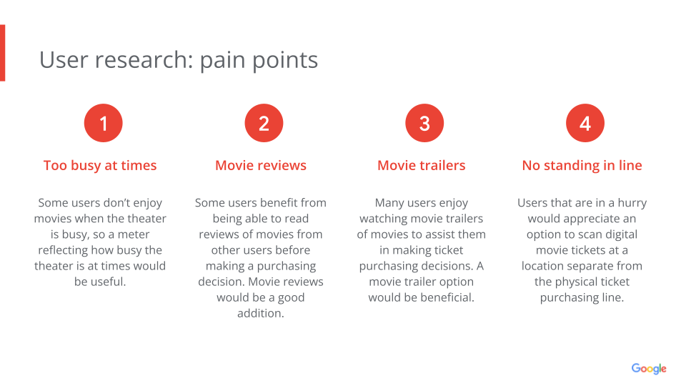
I love movies, so this was a fun project to take on. I don't mind standing in line for movie tickets - but I also understand the frustration of having to wait in line to buy tickets with today's technology available to us.
This is a local movie theater that will be opening soon. They are small, but they want to be able to compete with 'the big dogs' and offer something that makes them competitive to said competition. Being able to allow users to connect with them via an app and purchase tickets on the go is a huge win for them.
Researching the solution
Surveys | Competitive Audit Report | Empathy Maps | User Personas | User Stories | Problem Statement | Journey Maps
My first step was to start digging into research. I interviewed different people from various walks of life in an attempt to get a very good understanding of who would be interested in such an app in the area.
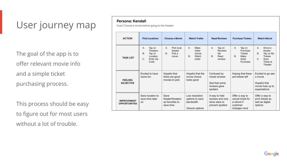
I performed a survey and online poll of more potential users, performed a competitive audit report, created user personas, problem statements, and user journey maps to better understand the future users and competition.
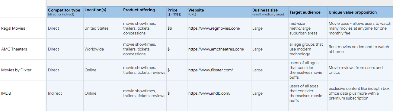
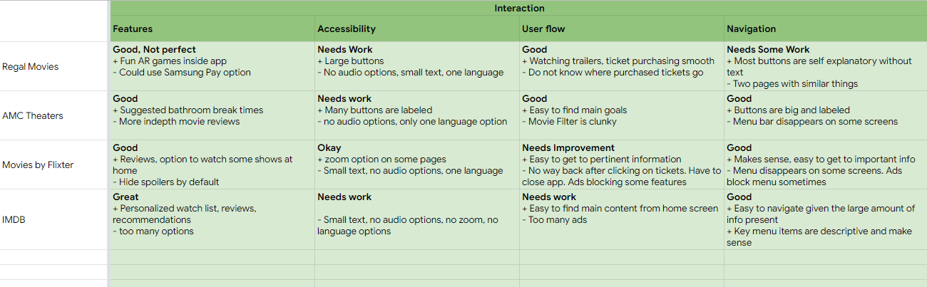
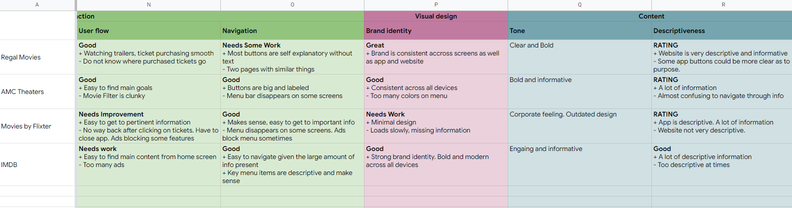
Competitive Audit Report
I did some searching on the Internet and found a few competitor companies. All of these options were different from one another and a bit different from what I was looking for as well, so that was great news. I wanted to see what these companies did right, and I also wanted to see what they were doing wrong. By comparing the "rights" and the "wrongs" I could get a better understanding of what I was trying to accomplish.
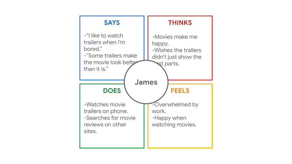
Empathy Maps
After talking with a few future customers, I tried to get a better understanding of what was going through their heads during my questions and conversations with them. I did my best to be empathic with them. I tried to summarize these thoughts into some empathy maps like the one below.
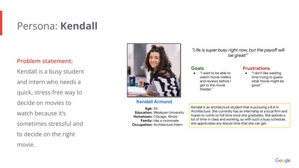
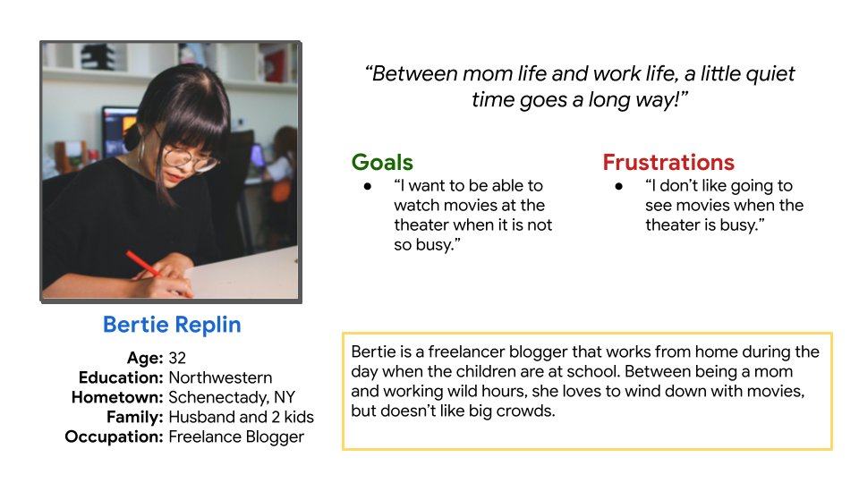
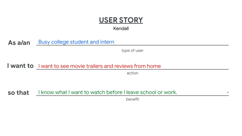
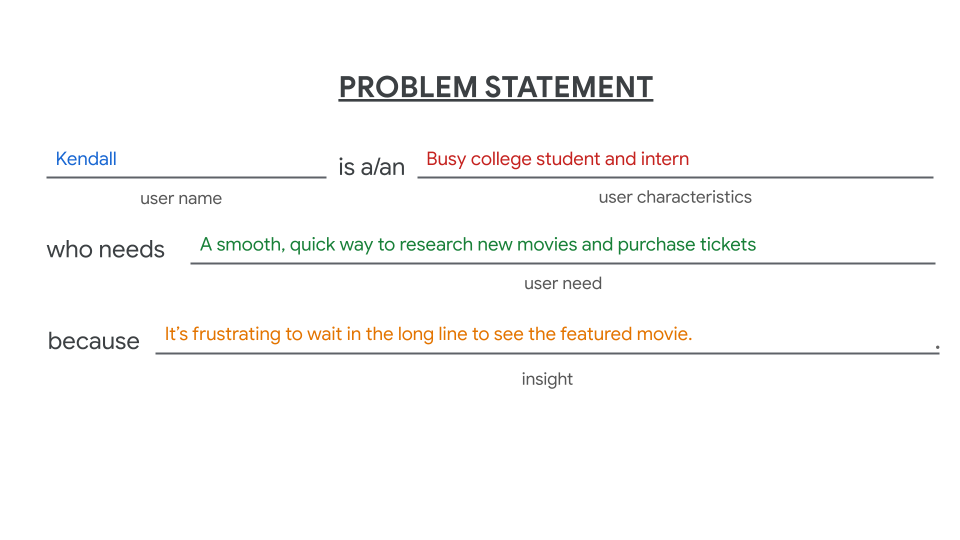
User Personas
Based on my research, I noticed a few different user types that would benefit from using the product I was creating. I decided to focus in on a few personas since their need felt like some of the strongest.
Defining Even Further
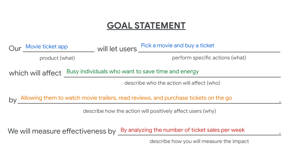
I further niched down with my research by defining a problem statement and goal statement based off of my User Personas to help me solidify the whole thing into something 'tangible'.
Starting the Design Process
Wireframes | Low Fidelity Prototypes | Usability Studies
I finally took the information that I painstakingly gleaned from local future movie-goers and began the process of mapping out a design.
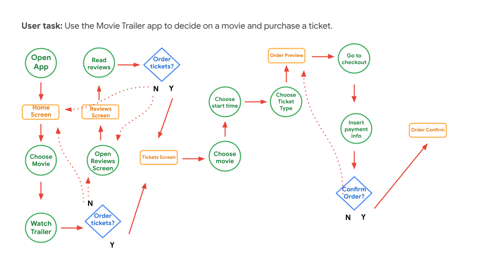
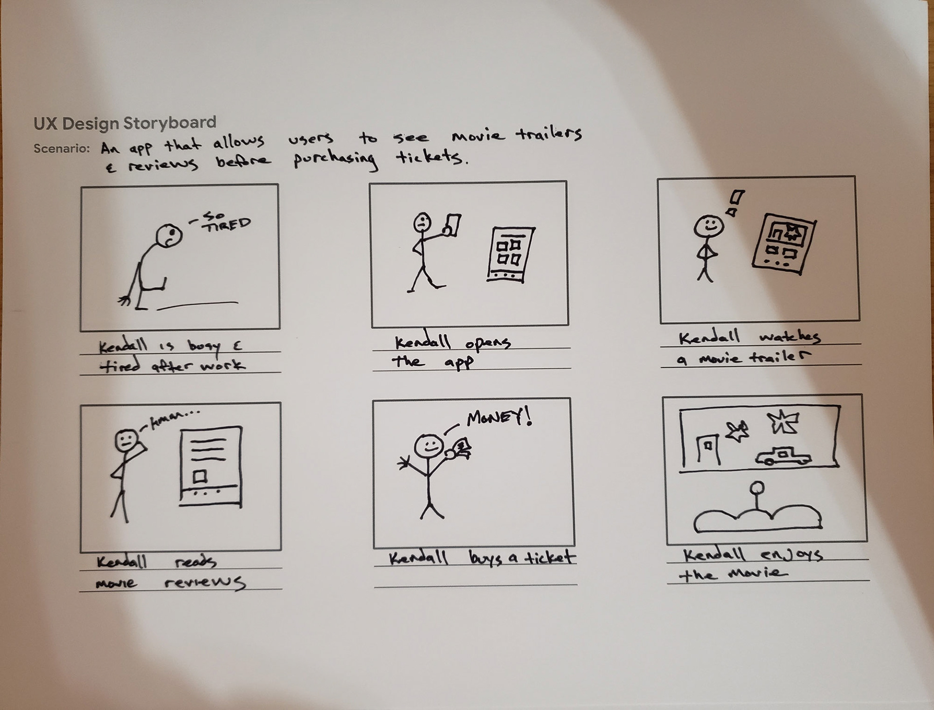
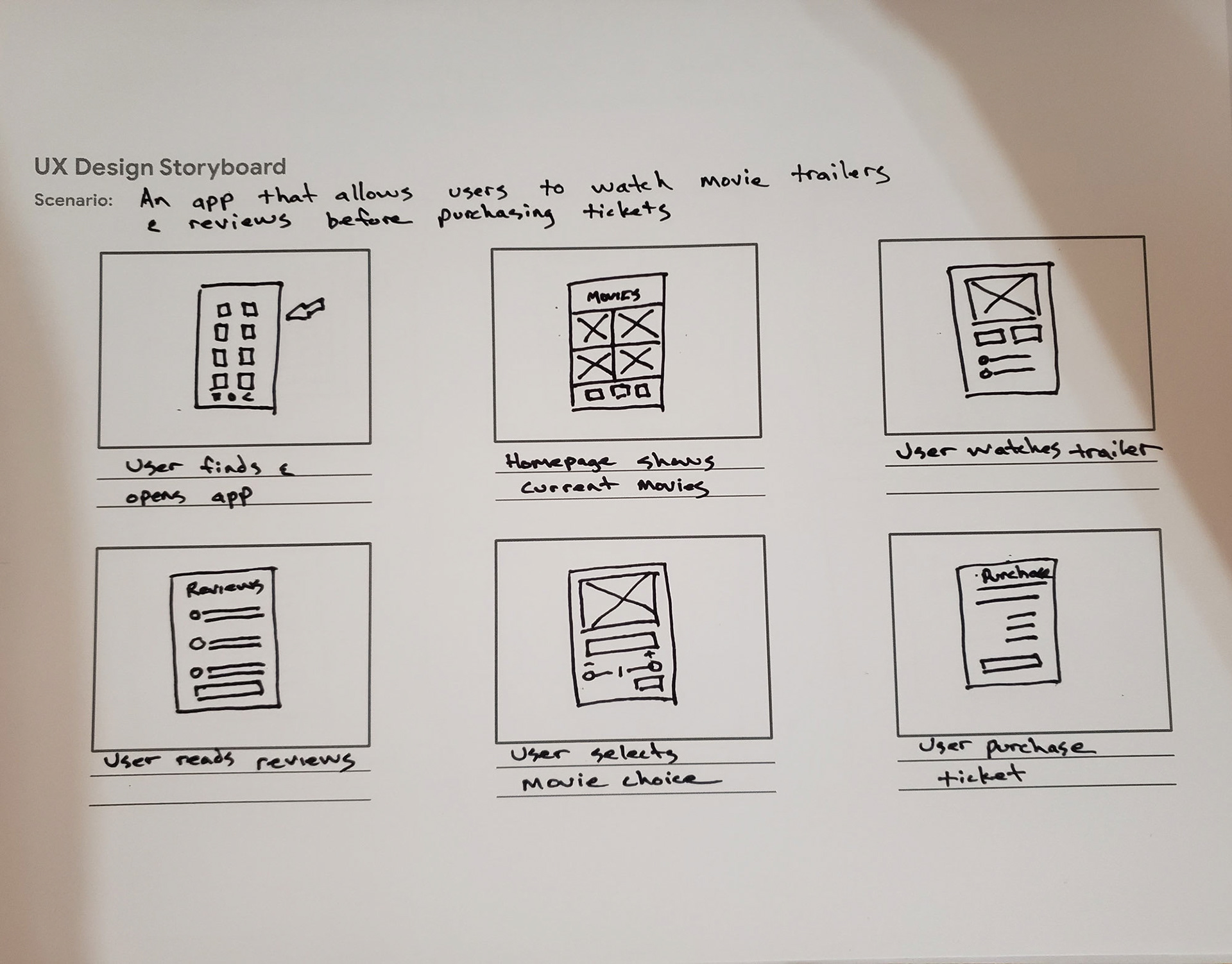
I began by creating storyboards to help me 'brainstorm' a bit further as to how I should design the app.
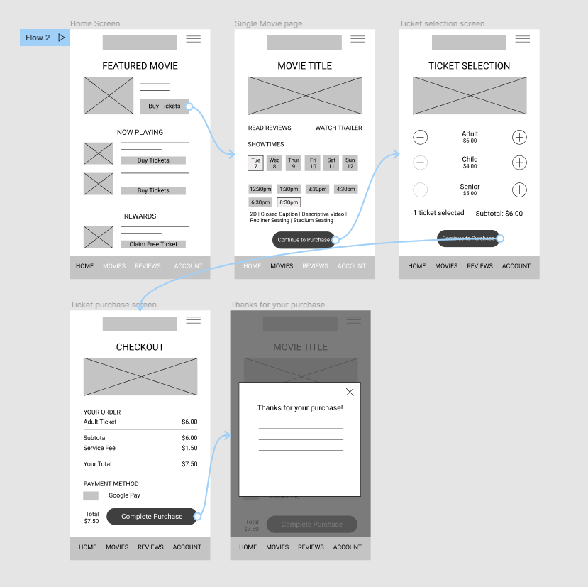
I then created paper wireframes first with old fashioned pen and paper. This was the first time creating paper wireframes, so that was a fun process. Once I hashed out some rough ideas on paper, I created digital wireframes and then connected all the dots together by creating a low fidelity protype.
Once the low fidelity prototypes were working, I subjected a few local users to try it out in order to find out what they thought and to see how the app handled 'in person'.
Paper Wireframes
These paper wireframes were very early in the process, and I was a little intimidated by actually having to hold a pen and draw something on paper.
Some of the ideas made it to the final design, but still this was very high level at this point.
Digital Wireframes
Being able to put myself "in the shoes" of other movie-goers that would be attending this theater was a thought-provoking process.
Being able to "say thanks" is a very "Small Business Springfield" way of doing things and I love it and everyone else loves it.
I would like to note that I will be updating this case study over time as I update the app with many more screens.
Low Fidelity Prototype
https://tinyurl.com/lowfitommy
I made a mistake with my prototype that I had not even noticed until much later. I did not add any back buttons, or ways to get back to the homepage. So, this caused some confusion, but I wanted to share the whole process, so this is where I was at.
Usability Studies
The results of my usability study weren't worthy of an epic tale, if I'm being honest. Everyone seemed to handle using the app fairly well.
Round 1 Findings:
Some users told me that the options for watching movie trailers were kind of confusing. Enough to make me realize that yes, that app screen was a bit goofy and needed to be reworked.
There was a lot happening on the home screen and that seemed to confuse enough users as well. I thought that I would need to simplify things there too - the direction I wanted users to take was not quite clear yet.
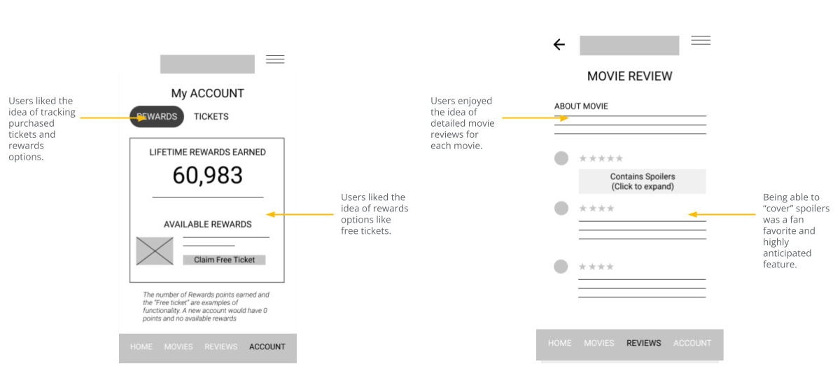
Users did like the idea of movie reviews being added to the app but they were afraid of possible spoilers. I would think more about that and figure out a way to keep that feature but improve it to everyone's liking.
Round 2 Findings:
Users were confused by there being a nav button for a profile page and also a button for a settings page. They felt like these should be combined. Granted I didn't have those screens done and added to the prototype yet. The purpose of this was to see if they could buy a movie ticket, so I would come back to that.
Users told me that the total price seemed to be missing from the 'ticket selection' screen. That was very true, I had forgotten to add something like that on that page - and it needed to be there. Good catch!
Users told me that there were too many pages for all of the same things, like trailers and reviews. I needed to simplify the whole process.
Refining The Design
Mockups | Hi Fidelity Prototype | Accessibility
Mockups
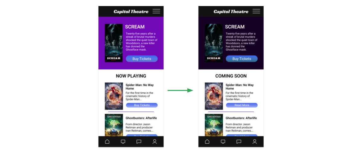
I found that the theater only has one movie at a time, and this helped out - because it would be less confusing on the home screen. The colors were a complaint as well, so I updated the home screen to reflect these changes.
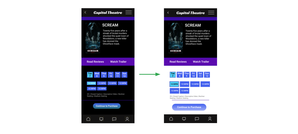
The "movie times" buttons were too small - these details were updated to make the app more pleasing to the eye and easier to use for many users.
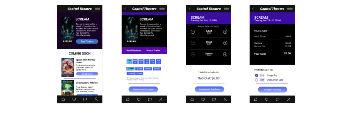
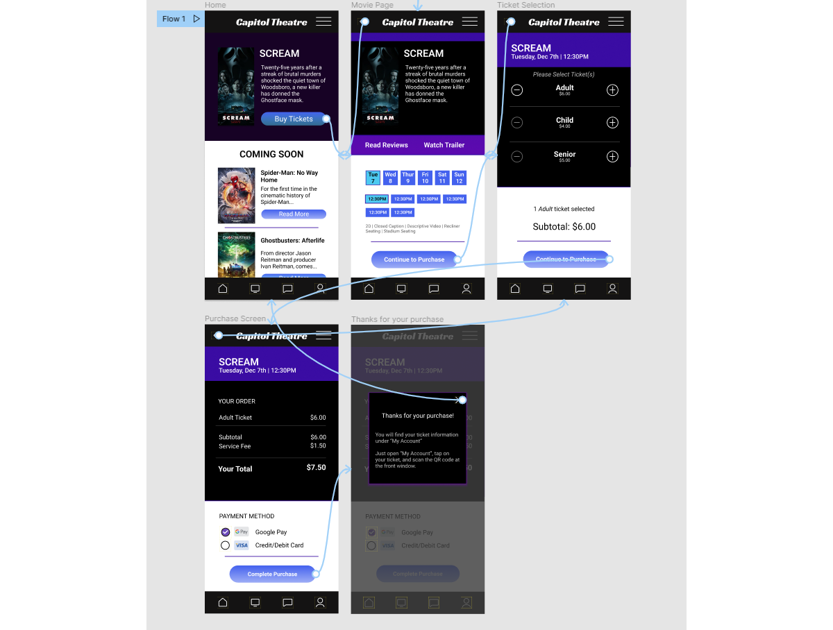
High Fidelity Prototype
Here's a nice high-fidelity version of the app prototype. It's just a few screens, but I did remember to update the design with a back button.
https://tinyurl.com/tommychapman
Accessibility Considerations
There were concerns of the colors being too bold for some users' eyes. I am working on creating a more user-friendly color palette while keeping consistent with the brand.
The text may need to be larger in many places. I am working on creating a balance between the text and the surrounding elements that will be much easier on the eyes.
The navigation menu is not as clear as it could be. I am working on designing a new menu that is clearer in its meaning.
Going Forward
Takeaways | Next Steps
Takeaways
Impact:
The impact of this design should increase ticket sales for this local theater, by putting an easy-to-use option for purchasing digital tickets into the hands of local movie-goers.
What I learned:
I learned just how much effort goes on "behind the scenes" into making sure an experience is simple and easy to use. Just because a design looks simple, doesn't mean it was easy to create.
Next Steps
There are more functions that need to be built into this app that were touched upon in the beginning of this UX Design process. I've learned a lot during this process and I feel like I do need to return to the design and continue building onto it.
I will be adding a "Crowd Meter" function that measures (generally) the amount of traffic inside the theater at certain times.
I will be building out the "My Account" section which will track previous and current ticket purchases and rewards.